Graphing
Build a Specific Graph
After you ask a question about your data and receive feedback, you can then scroll to the bottom of the page, where you can find the options to choose from 5 graph options. Click one of these buttons to have a graph built for you.
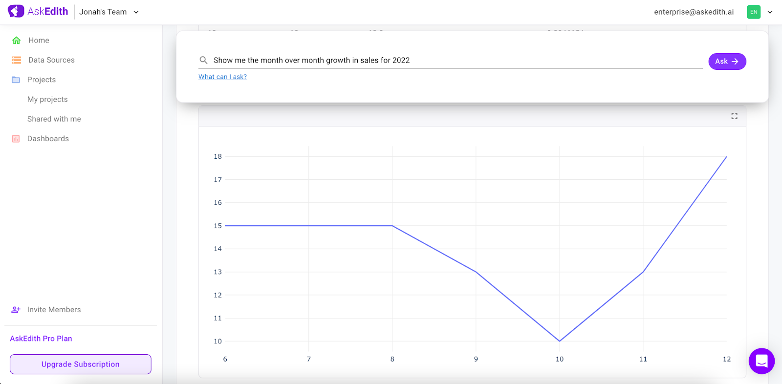
Line Graph
This type of graph is usually used to view trends over time. For this, you need to ask a question where time is one of the parameters. For example, "Show me the month over month growth in sales for 2022." This will map the months on the x-axis and profit on the y-axis.
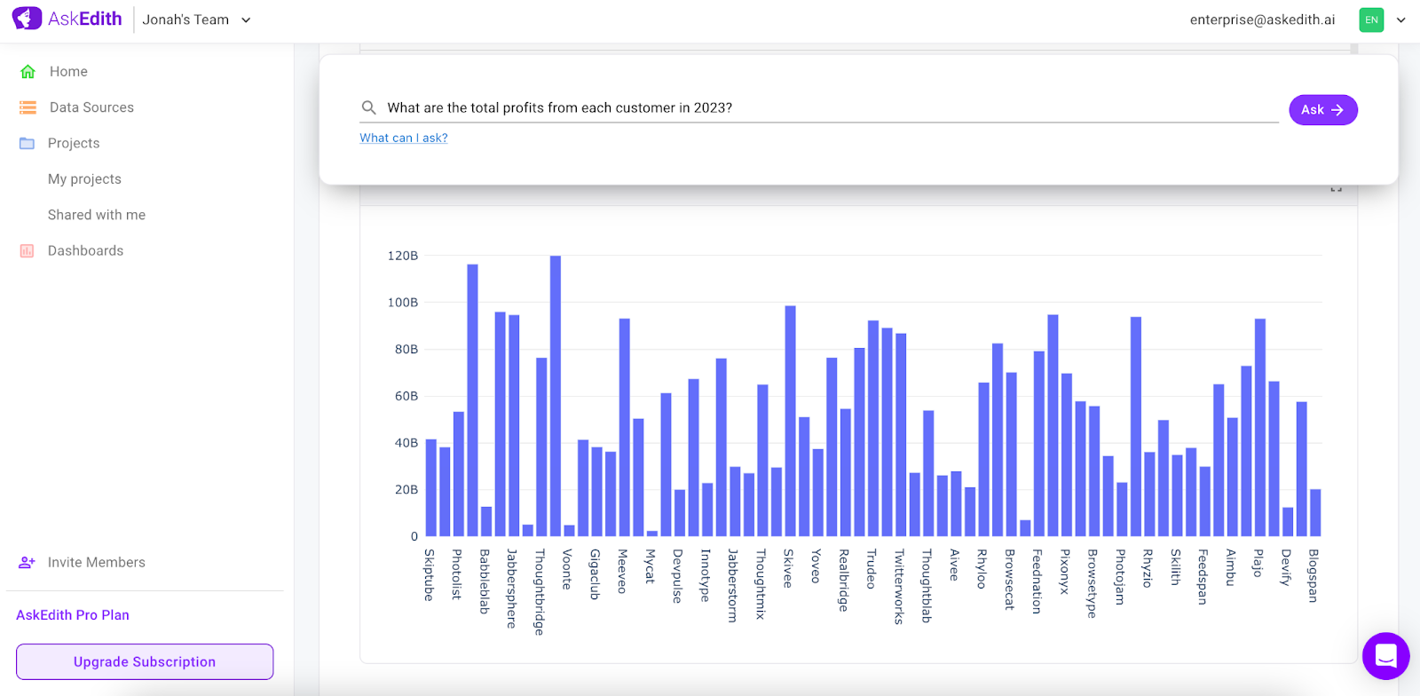
Bar Graph
Bar graphs are best for comparing the size, frequency or amount of different categories. Your question could be "What are the total profits from each customer in 2023?" Here, departments would go on the y-axis and sales figures on the x-axis.
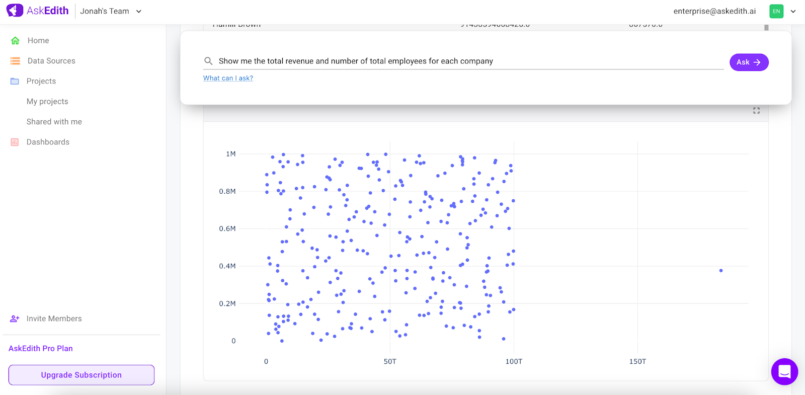
Scatter Graph
Scatter plots show the relationship between two sets of data points. A relevant question could be "Show me the total revenue and number of total employees for each company." By mapping employee's age on the x-axis and productivity on the y-axis.
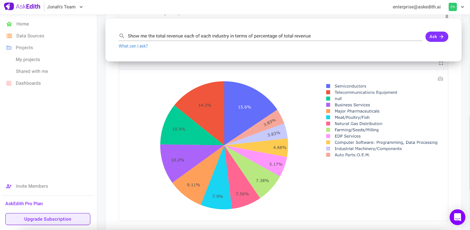
Pie Chart
These are used to compare parts of a whole. Ask a question like "What percentage of the budget does each department receive?" This data will then be represented as segments of the circle, with each segment corresponding to a department.
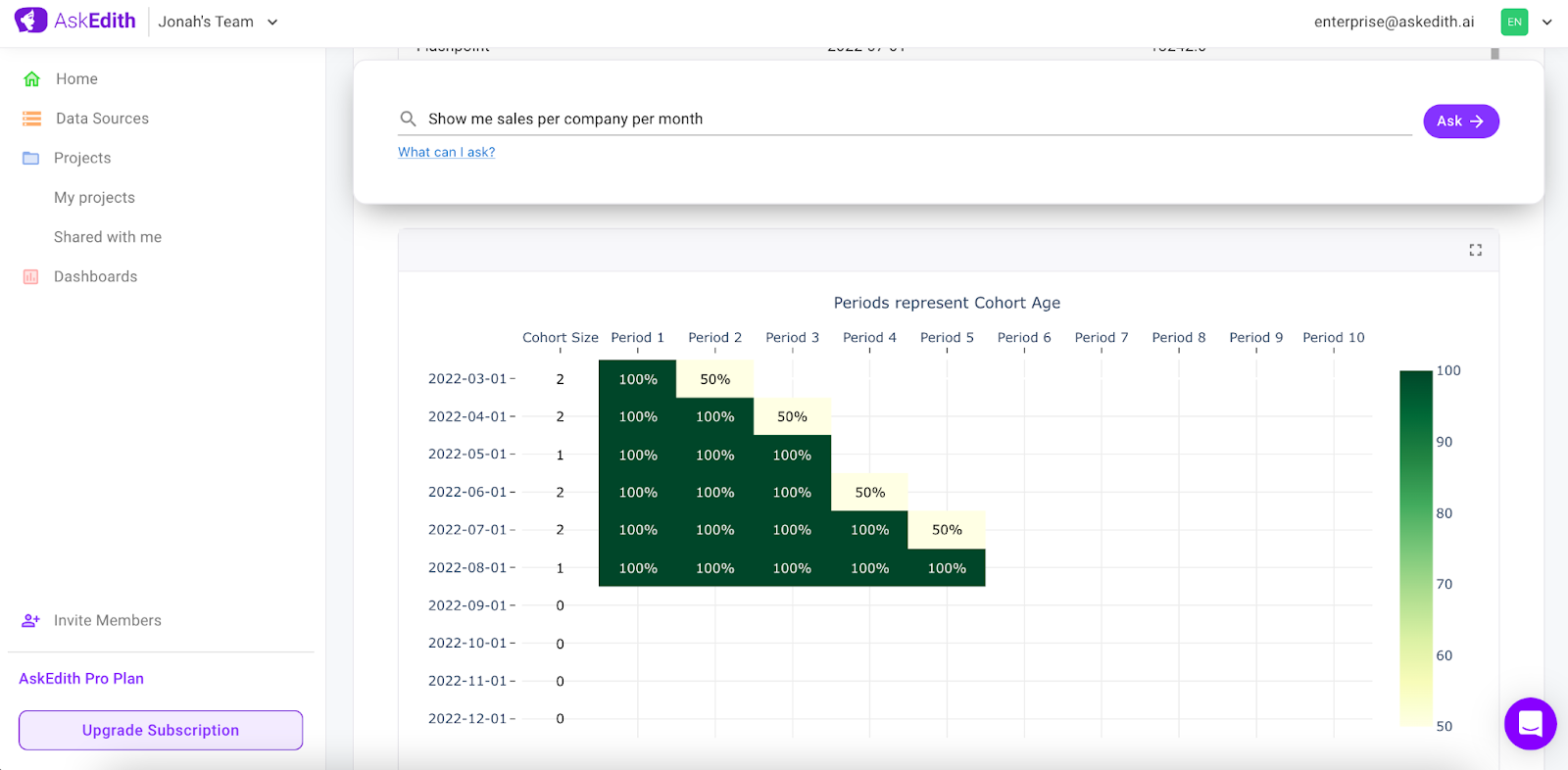
Cohort Retention Heatmap
This kind of graph is used to track activities of a group of users over a period. Ask a question like "Show me events for each user per time period", which gives you two columns- number of events per user and timestamps. For questions related to cohort retention heatmaps, it's important that the data can be broken down into time intervals and categories of users or groups.
For an in depth use case you can check out this blog.
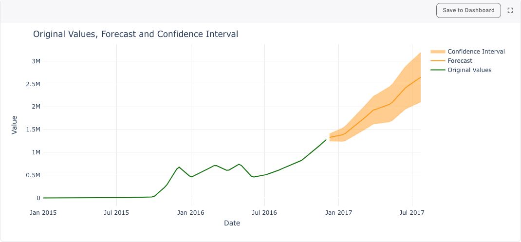
Forecast Graph
The forecast button is used to generate a confidence interval displaying likely future values by utilizing exponential smoothing functions. To generate this graph, you will need a column with values and a column with date/times. This would be used with questions such as: "Show me sales by month for 2023?" or "How many new users per day did we have in 2022?".
Graph Refreshing
To refresh the data in your graphs there is a button available at the top right of your dashboard.
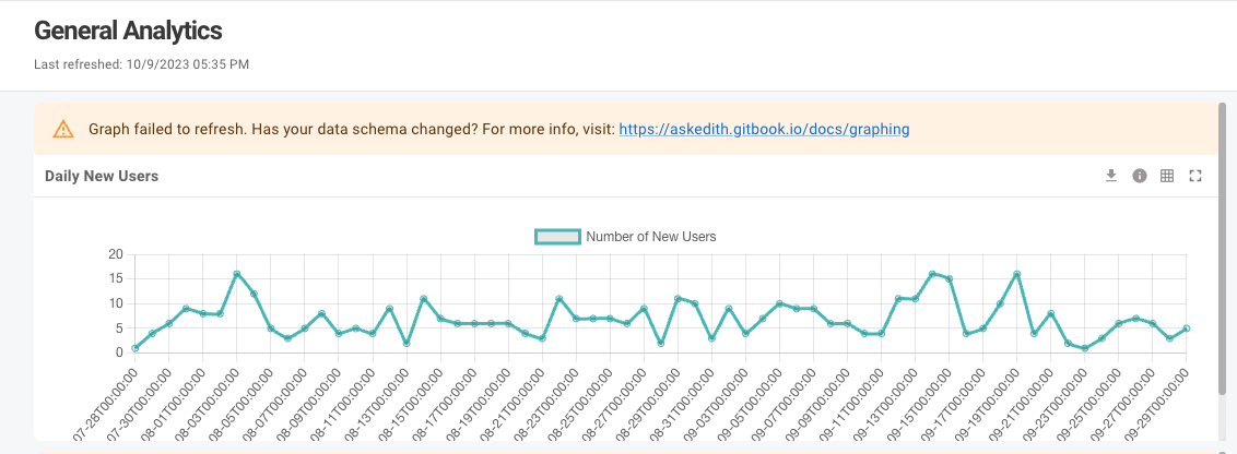
Potential Issues
If you change your underlying data format, your graph may not be able to refresh. In that case you will see an error like below. You will have to re-ask and add this question to your dashboard.
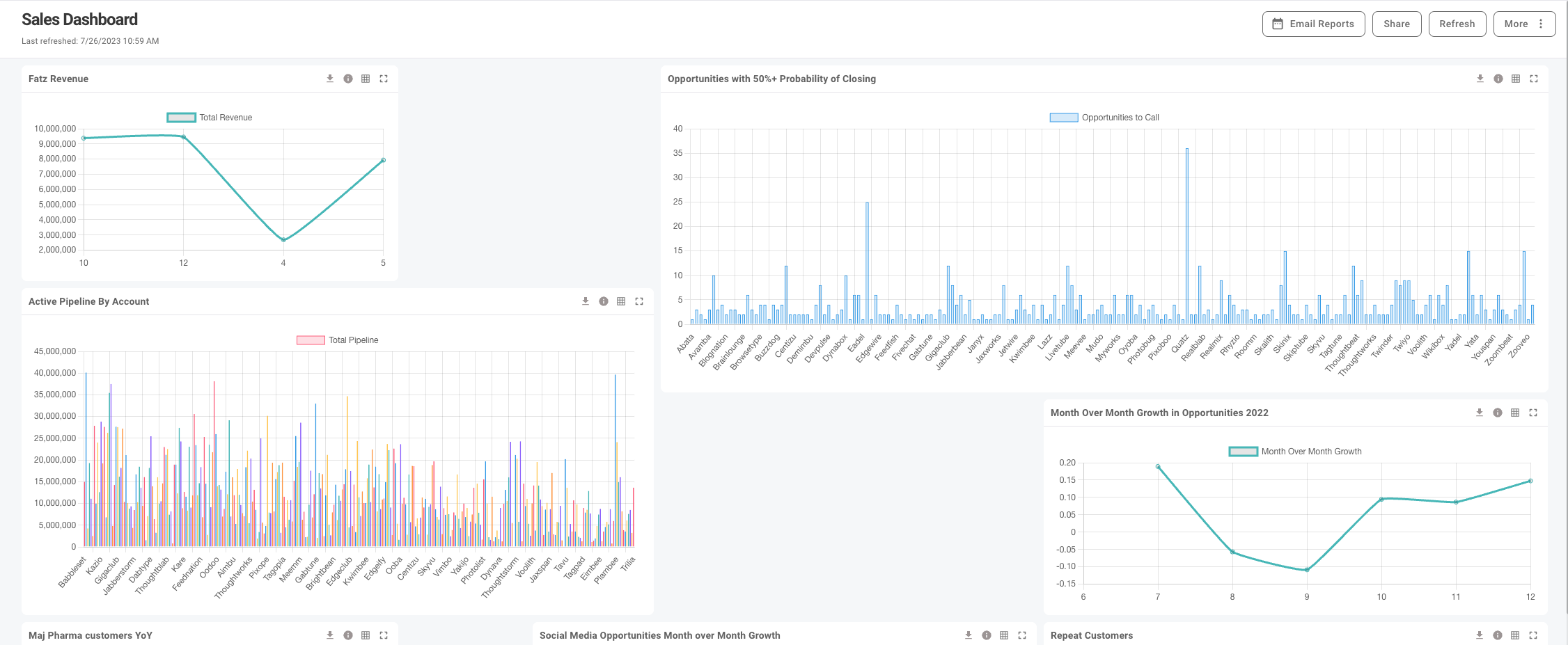
Once you have a graph you like, save it to one of your Dashboards.
Last updated